Google's Material 3 is a comprehensive design system built with accessibility as a core principle.
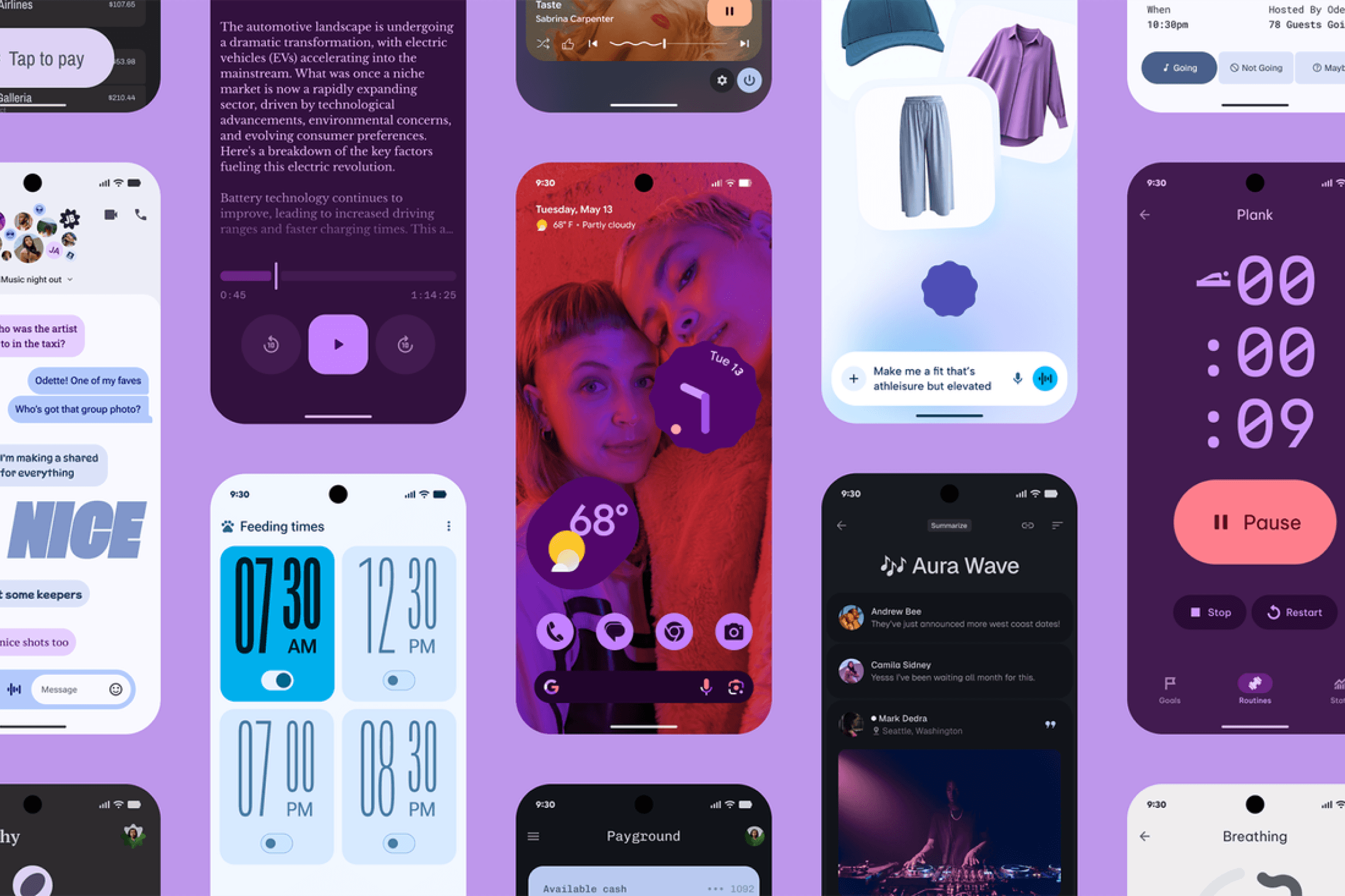
Material Design 3 (Google's design system) treats accessibility as a core part of the system, not a layer added on top. Its guidelines cover color, touch targets, and layout structure, with built-in tooling to help teams check compliance as they design.
Why it matters for you:
- Color contrast built into the system: Material Design 3 uses a tonal color system built on luminance rather than hue. This means any color scheme generated through the Material Theme Builder is designed to meet WCAG contrast requirements by default, with a minimum ratio of 4.5:1 for regular text and 3:1 for large text.
- Touch target sizing: The guidelines recommend a minimum touch target size of 48x48dp for interactive elements, with 7-10mm as the ideal physical size on screen. This ensures users with motor impairments, or anyone using a phone one-handed, can reliably hit interactive elements.
- Dynamic Type and text scaling: Like Apple's HIG, Material Design expects components to support large text sizes and flexible layouts. Designing with responsive spacing and fluid components means your UI holds up when a user increases their font size through system settings.
- Testing with real tools: The Material Theme Builder includes built-in contrast checking, so you can verify your color choices meet accessibility standards before anything goes to development.
Use Material Design's guidelines as your baseline when building Android or cross-platform apps. The tonal color system in particular is one of the clearest practical frameworks for making accessible color decisions without having to manually test every combination.